Chapter 1 Introduction
1.1 What is Data Visualization?
Data visualization is a graphic representation that expresses the significance of data. It reveals insights and patterns that are not immediately visible in the raw data. It is an art through which information, numbers, and measurements can be made more understandable. According to (Friedman 2008):
The primary goal of data visualization is to communicate information clearly and effectively through graphical means. It does not mean that data visualization needs to look boring to be functional or extremely sophisticated to look beautiful. To convey ideas effectively, both aesthetic form and functionality need to go hand in hand, providing insights into a rather sparse and complex data set by communicating its key-aspects more intuitively.
The main goal of data visualization is to communicate information clearly and effectively through graphical means. It doesn’t mean that data visualization needs to look boring to be functional or extremely sophisticated to look beautiful. To convey ideas effectively, both aesthetic form and functionality need to go hand in hand, providing insights into a rather sparse and complex data set by communicating its key-aspects in a more intuitive way.
“Data is the new oil” may be a cliche, but it is true. Like oil, data in its raw, unrefined form is pretty worthless. To unlock its value, data needs to be refined, analyzed and understood (Disney 2017). More and more organizations are seeing potential in their data connections, but how do you allow non-experts to analyze data at scale and extract potentially complex insights? One answer is through interactive graph visualization.
Information visualization is the art of representing data so that it is easy to understand and manipulate, thus making the information useful. Visualization can make sense of information by helping to find relationships in the data and support (or disproving) ideas about the data. (Disney 2017) shares some examples and common uses of information visualization, such as:
| Benefit | Example |
|---|---|
| Presentation: to explain or persuade |  Source: (“Best Real Estate Investing Example Powerpoint Presentation Examples,PPT:SG-14716000770769” 2019) Source: (“Best Real Estate Investing Example Powerpoint Presentation Examples,PPT:SG-14716000770769” 2019) |
| Exploratory Analysis: to identify relationships or unusual cases in the data | 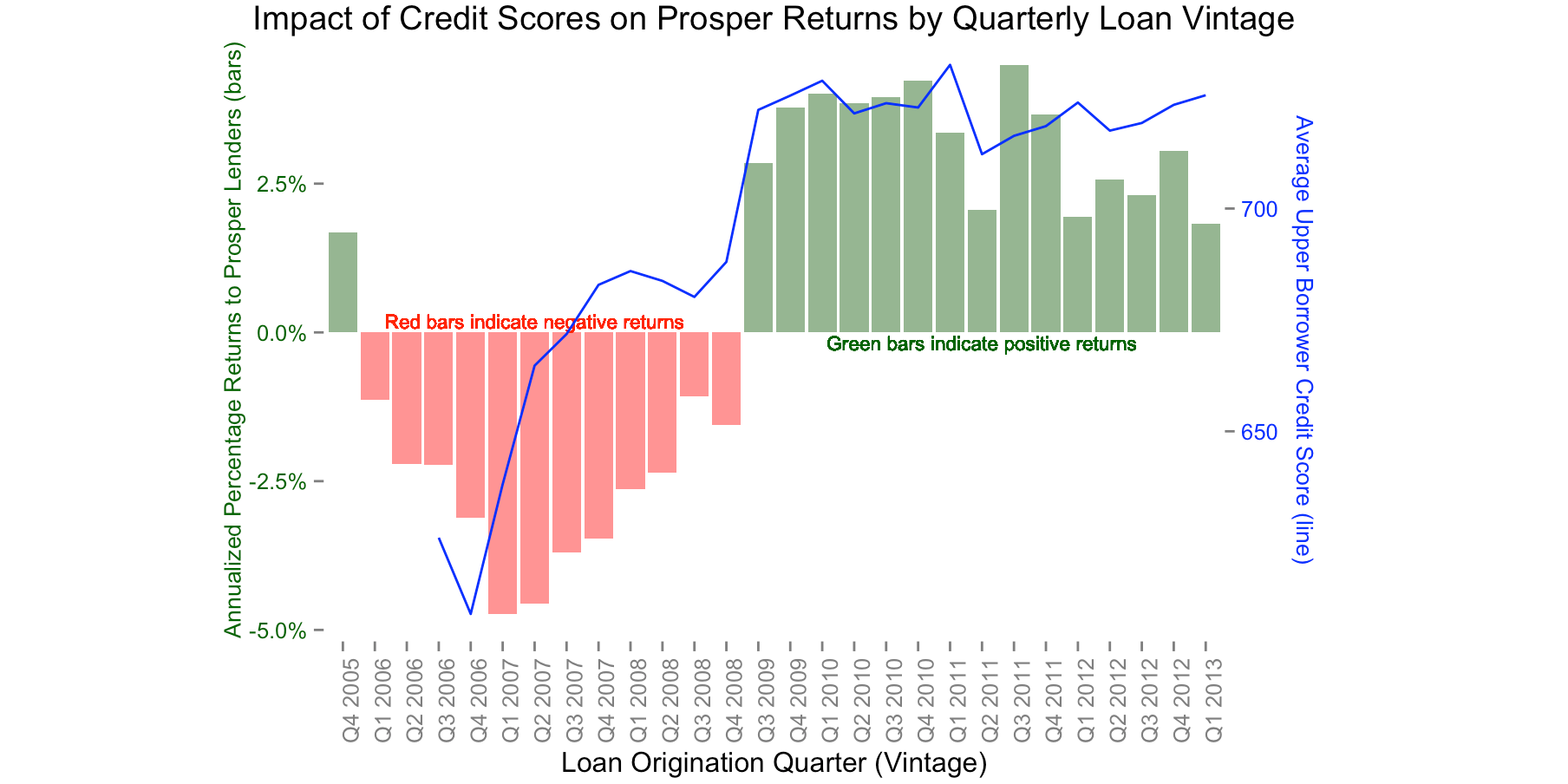 Source: (smith 2019) Source: (smith 2019) |
| Confirmatory Analysis: to confirm our understanding and analysis of the data | 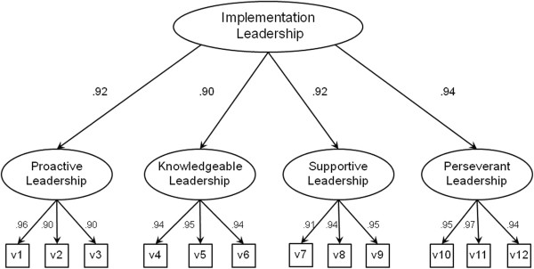 Source: (Aarons 2014) Source: (Aarons 2014) |
Why data visualization is such a powerful tool:
- Intuitive: Presenting a graph as a node-link structure instantly makes sense, even to people who have never worked with graphs before.
- Fast: It is fast because our brains are great at identifying patterns, but only when data is presented in a tangible format. Armed with visualization, we can spot trends and outliers very effectively.
- Flexible: The world is densely connected, so as long as there is an interesting relationship in your data somewhere, you will find value in graph visualization.
- Insightful: Exploring graph data interactively allows users to gain more in-depth knowledge, understand the context and ask more questions, compared to static visualization or raw data.
1.2 Importance of Data Exploration
“Data exploration tasks are those of examining data without having an a priori understanding of what patterns, information, or knowledge it might contain.” (Jeff Baker 2009) While the majority of research has been on the output of and creation of visualizations, but the important aspect of these tasks is to first understand the data that is being presented. As mentioned in (Jeff Baker 2009), the main aspect of exploration is the understanding of perception in comparing two measures in a data source. The contrast between object A and object B shows an ability to compare by saying A is greater than B or the opposite occurs. As a brief introduction, data exploration is the process of finding the best way to pull out an outcome that a specific audience can perceive. By understanding the different types of perceptions and studying data based off of these concepts, data exploration is pivotal in the final visualization process due to taking the audience of the viz into account first and foremost.
Here are some data exploration methods for references:
Companies can conduct data exploration via a combination of automated and manual methods.
Analysts commonly use automated tools such as data visualization software for data exploration because these tools allow users to quickly and simply view most of the relevant features of a data set. From this step, users can identify variables that are likely to have interesting observations.
By displaying data graphically – for example, through scatter plots, density plots or bar charts – users can see if two or more variables correlate and determine if they are good candidates for further analysis, which may include:
Univariate analysis: The analysis of one variable. Bivariate analysis: The analysis of two variables to determine their relationship. Multivariate analysis: The analysis of multiple outcome variables. Principal components analysis: The analysis and conversion of possibly correlated variables into a smaller number of uncorrelated variables. Manual data exploration methods may include filtering and drilling down into data in Excel spreadsheets or writing scripts to analyze raw data sets.
1.3 Importance of Data Visualization
According to the World Economic Forum, the world produces 2.5 quintillion bytes of data every day, and 90% of all data has been created in the last two years. With so much data, it’s become increasingly difficult to manage and make sense of it all. It would be impossible for any single person to wade through data line-by-line and see distinct patterns and make observations. Data proliferation can be managed as part of the data science process, which includes data visualization(“Data Visualization,” n.d.). Data visualization is the presentation of data in a pictorial or graphical format. It enables decision-makers to see analytics presented visually, so they can grasp difficult concepts or identify new patterns. With interactive visualization, you can take the concept a step further by using technology to drill down into charts and graphs for more detail, interactively changing what data you see and how it’s processed(“History of Data Visualization,” n.d.).
Data visualization has become an indispensable part of the business world and an ever increasing part of managing our daily life. Effective data visualization should be informative, efficient, appealing, and in some cases interactive and predictive. Pittenturf explains basic criteria that a data visualization should satisfy to be effective (Pittenturf 2018):
| Criteria | Description |
|---|---|
| Informative | The visualization should be able to convey the desired information from the data to the reader. |
| Efficient | The visualization should not be ambiguous. |
| Appealing | The visualization should be captivating and visually pleasing. |
| Interactive and Predictive (Optional) | The visualizations can contain variables and filters with which the users may interact to predict results of different scenarios. |
Pittenturf goes on to give various day-to-day examples where visualization gives a better understanding of the data. One straightforward example used by Pittenturf is that of an energy bill. Pittenturf states that when we, as consumers, receive an energy bill, we usually look at the graph in the bill first before proceeding to read the text in the bill. Pittenturf states that consumers are more likely to analyze and understand the visualizations before reading further along. The article ends with Pittenturf emphasizing the importance of data visualizations in our businesses as well as in our daily lives. It gives a simple, short and crisp understanding of what data visualization is and how it is relevant to everyone. Data visualization is an aid to get a better understanding of the complex insights that any business data provides. Most of the data used by the businesses are highly unstructured, and these businesses can get a better understanding of their businesses by visualizing their data.
Another early adopter of graph visualization techniques was the financial services industry. Fraud detection is about finding unusual connections between accounts, transactions, insurance policies, devices, etc. There is great value in visualizing that data as a graph. Known fraud detection is primarily automated with rule scoring and pattern matching. Visualization lets you review edge-cases and outliers more quickly. Speed is important because sometimes analysts only have seconds to approve or deny a transaction. In those cases, visualizations are simple, small and with limited interaction. To get a clear overview quickly, analysts need effective layouts. Other functionalities, like expanding and filtering help fraud analysts to see context on demand.
Three things are consistent across both graph visualization use cases:- They involve highly connected data (apparently).
- That highly connected data conceals risk insight.
- That insight is needed to power quick and confident decision making.
“The only new thing in the world is the history you do not know.” Harry S Truman
Given the recent explosion in data availability and visualization tools, it would be natural to assume that statistical graphics and data visualizations are relatively modern developments. However, data visualization is not a modern product it has developed over time to incorporate the tools we use today and the trends we foresee. The graphic representation of quantitative information has deep roots that reach into the histories of the earliest map-making and visual depictions, and up to thematic cartography, statistics, medicine, and other fields. Developments in technologies (printing, reproduction) mathematical theory and practice, and empirical observation and recording, and those developments enabled the broader use of graphics and new advances in form and content. It is essential to gain some understanding of the background of data visualization to help us in the proper application and execution of current visualization concepts. The following section provides an overview of the intellectual history of data visualization from medieval to recent times, as well as describes and illustrates some significant advances along the way (Friendly 2006).
| Time | Phase | Description |
|---|---|---|
| Pre-17th Century | Early Maps and Diagrams | Data visualization has come a long way. Before the 17th century, data visualization already existed. Though displayed in other formats such as maps, the content is much similar to today’s visualizations, which mostly presented geologic, economic, and medical data. The earliest seeds of visualization arose in geometric diagrams, in tables of the positions of stars and other celestial bodies, and in the making of maps to aid in navigation and exploration. |
| 1600-1699 | Measurement and Theory | Among the most important problems of the 17th century were those concerned with the physical measurement of time, distance, and space for astronomy, surveying, map making, navigation and territorial expansion. This century also saw considerable new growth in theory as well as the dawn of practical application. |
| 1700-1799 | New Graphic Forms | With some rudiments of statistical theory, data of interest and importance, and the idea of graphic representation somewhat established the 18th century witnessed the expansion of these aspects to new domains and new graphic forms. |
| 1800-1850 | Beginnings of Modern Graphics | With the foundation provided by the previous innovations of design and technique, the first half of the 19th century witnessed explosive growth in statistical graphics and thematic mapping at a rate which would not equal until modern times. |
| 1850–1900 | The Golden Age of Statistical Graphics | By the mid-1800s, all the conditions for the rapid growth of visualization had generated a “perfect storm” for data graphics. Official state statistical offices were established throughout Europe, in recognition of the growing importance of numerical information for social planning, industrialization, commerce, and transportation. |
| 1900-1950 | The Modern Dark Ages | If the late 1800s were the “golden age” of statistical graphics and thematic cartography, the early 1900s can be called the “modern dark ages” of visualization. There were few graphical innovations, and by the mid-1930s, the enthusiasm for visualization which characterized the late 1800s had been supplanted by the rise of quantification and formal, often statistical, models in the social sciences. |
| 1950–1975 | Rebirth of Data Visualization | Still under the influence of the formal and numerical zeitgeist from the mid-1930s on, data visualization began to rise from dormancy in the mid-1960s |
| 1975–present | High-D, Interactive and Dynamic Data Visualization | During the last quarter of the 20th century, data visualization has blossomed into a mature, vibrant and multidisciplinary area of research, as seen in this handbook, and software tools for a wide range of visualization methods and data types are available for every computer. |
1.3.1 Key Figures in the History of Data Visualization
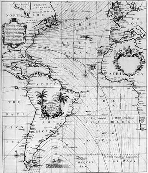
The idea of visualizing data is old: After all, that’s what a map is—a representation of geographic information—and we’ve had maps for about 8,000 years. But it was rare to graph anything other than geography. (n.d.)(https://www.smithsonianmag.com/history/surprising-history-infographic-180959563/) The history of data visualization is full of incredible stories marked by significant events, led by a few key players. The article (Infogram 2016) introduces some of the fantastic men and women who paved the way by combining art, science, and statistics. One of them is Charles Joseph Minard, whose most famous work is the map of Napoleons Russian campaign of 1812 which could use as a data product for Data Visualization. Below we have some visualizes with their famous works and other stories in the article (Infogram 2016).
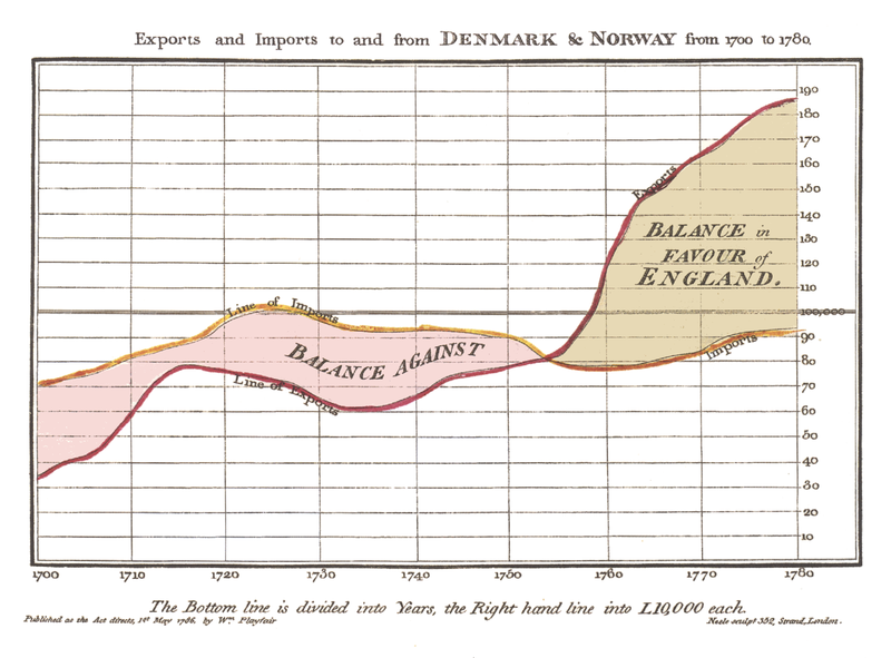
1.3.1.1 William Playfair (1759–1823)
William Playfair is considered the father of statistical graphics, having invented the line and bar chart are used so often today. He is also credited with having created the area and pie chart. Playfair was a Scottish engineer and political economist who published “The Commercial and Political Atlas” in 1786. This book featured a variety of graphs including the image below. In this famous example, he compares exports from England with imports into England from Denmark and Norway from 1700 to 1780.
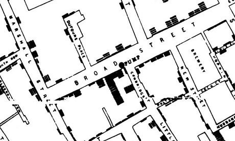
1.3.1.2 John Snow (1813–1858)
In 1854, a cholera epidemic spread quickly through Soho in London. The Broad Street area had seen over 600 dead, and the surviving residents and business owners had primarily fled the terrible disease. Physician John Snow plotted the locations of cholera deaths on a map. The surviving maps of his work show a method of tallying the death counts, drawn as lines parallel to the street, at the appropriate addresses. Snow’s research revealed a pattern. He saw an evident concentration around the water pump on Broad Street, which helped find the cause of the infection.
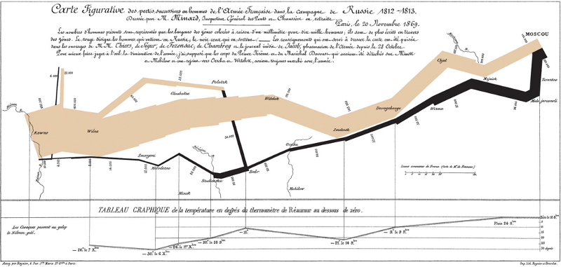
1.3.1.3 Charles Joseph Minard (1781–1870)
Charles Joseph Minard was a French civil engineer famous for his representation of numerical data on maps. His most famous work is the map of Napoleon’s Russian campaign of 1812 illustrating the dramatic loss of his army over the advance on Moscow and the following retreat. This classic lithograph dates back to 1869, displaying the number of men in Napoleon’s 1812 Russian army, their movements, and the temperatures they encountered along their way. It has been called one of the “best statistical drawings ever created.” The work is an essential reminder that the fundamentals of data visualization lie in a nuanced understanding of the many dimensions of data. Tools like D3.js and HTML are no proper without a firm grasp of your dataset and sharp communication skills. It represents the earliest beginning of data journalism.
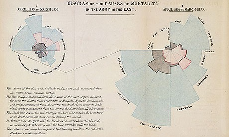
1.3.1.4 Florence Nightingale (1820–1910)
Florence Nightingale is famous for her work as a nurse during the Crimean War, but she was also a data journalist. She realized soldiers were dying from poor sanitation and malnutrition, so she kept meticulous records of the death tolls in the hospitals and visualized the data. Her coxcomb or rose diagrams helped her fight for better hospital conditions and ultimately save lives.
(Source:(Infogram 2016))
1.3.1.5 Edmond Halley (1656–1742)
Edmond Halley was an English astronomer, geophysicist, mathematician, meteorologist, and physicist who is best known for computing the orbit of Halley’s Comet. According to the BBC, Halley developed the use of contour lines on maps to connect and describe areas that display differences in atmospheric conditions from place to place. These lines are now commonly used to describe meteorological variation common to us from weather reports.
(Source:(Infogram 2016))
1.3.1.6 Charles de Fourcroy (1766–1824)
Charles de Fourcroy was a French mathematician and scholar. He produced a visual analysis of the work of French civil engineers and a comparison of the demographics of European cities.In 1782 he published Tableau Poléometrique, a treatise on engineering and civil construction. His use of geometric shapes predates the modern treemap, which is widely used today to display hierarchical data.
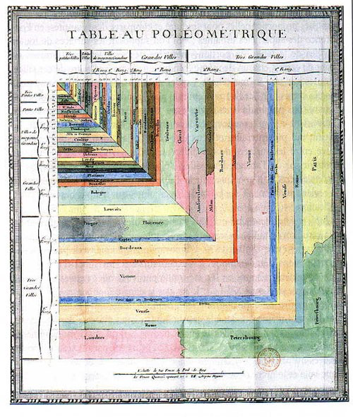
(Source:(Infogram 2016))
1.3.1.7 Luigi Perozzo (1856–1916)
Luigi Perozzo was an Italian mathematician and statistician who stood out for being the first to introduce 3D graphical representations, showing the relationships between three variables on the same graph. Perozzo published one of the first 3D representations of data showing the age group of the Swedish population between the 18th and 19th centuries.

(Source:(Infogram 2016))
1.4 Contemporary Visualists
1.4.1 Hans Rosling
Hans Rosling was a Swedish physician, academic, statistician, and public speaker. He was the Professor of International Health at Karolinska Institute and was the co-founder and chairman of the Gapminder Foundation, which developed the Trendalyzer software system.
Rosling was born in Uppsala, Sweden, on the 27th of July 1948. From 1967 to 1974 Rosling studied statistics and medicine at Uppsala University, and in 1972 he studied public health at St. John’s Medical College, Bangalore, India. He became a licensed physician in 1976 and from 1979 to 1981 he served as District Medical Officer in Nacala in northern Mozambique. On 21 August 1981, Rosling began investigating an outbreak of konzo, a paralytic disease first described in the Democratic Republic of the Congo. His investigations earned him a Ph.D. at Uppsala University in 1986.
Rosling took his interest in global health and developed stunning visualizations about it using statistical methods and data from the UN. He was a noted TED speaker and one of his most interesting TED talks is “Asia’s Rise: How and When” (Rosling 2009). In this video, Hans shows trends of the Western countries vs. Developing countries like India and China and makes predictions using stunning visualizations like the Bubble chart. He also predicts the exact date on which India and China will move ahead of USA as strong economic forces.
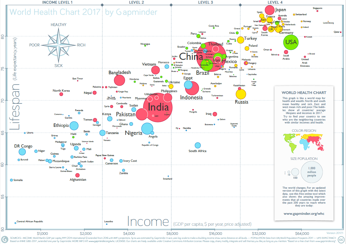
In this chart Rosling describes the relative standings of countries in terms of Income versus Lifespan. He started his analysis from year 1856 and this is where various countries stand till now. With the current growth trends, Rosling predicted that India and China will once again be the global leaders in Income and Healthcare by the year 2048.
Hans was the co-founder and developer of the Gapminder Foundation which is committed to promoting global sustainable development through the understanding of statistics and data describing issues at the local, national, and global level. One of the most important goals of the Gapminder foundation is to end ignorance in the world by developing fact-based visualizations to present the world as it is (Ruan et al. 2017).
As part of Gapminder, Hans Rosling has developed many interactive and intuitive visualizations. Gapminder provides free teaching material to dismantle misconceptions and promote a fact-based worldview (Rosling, n.d.).
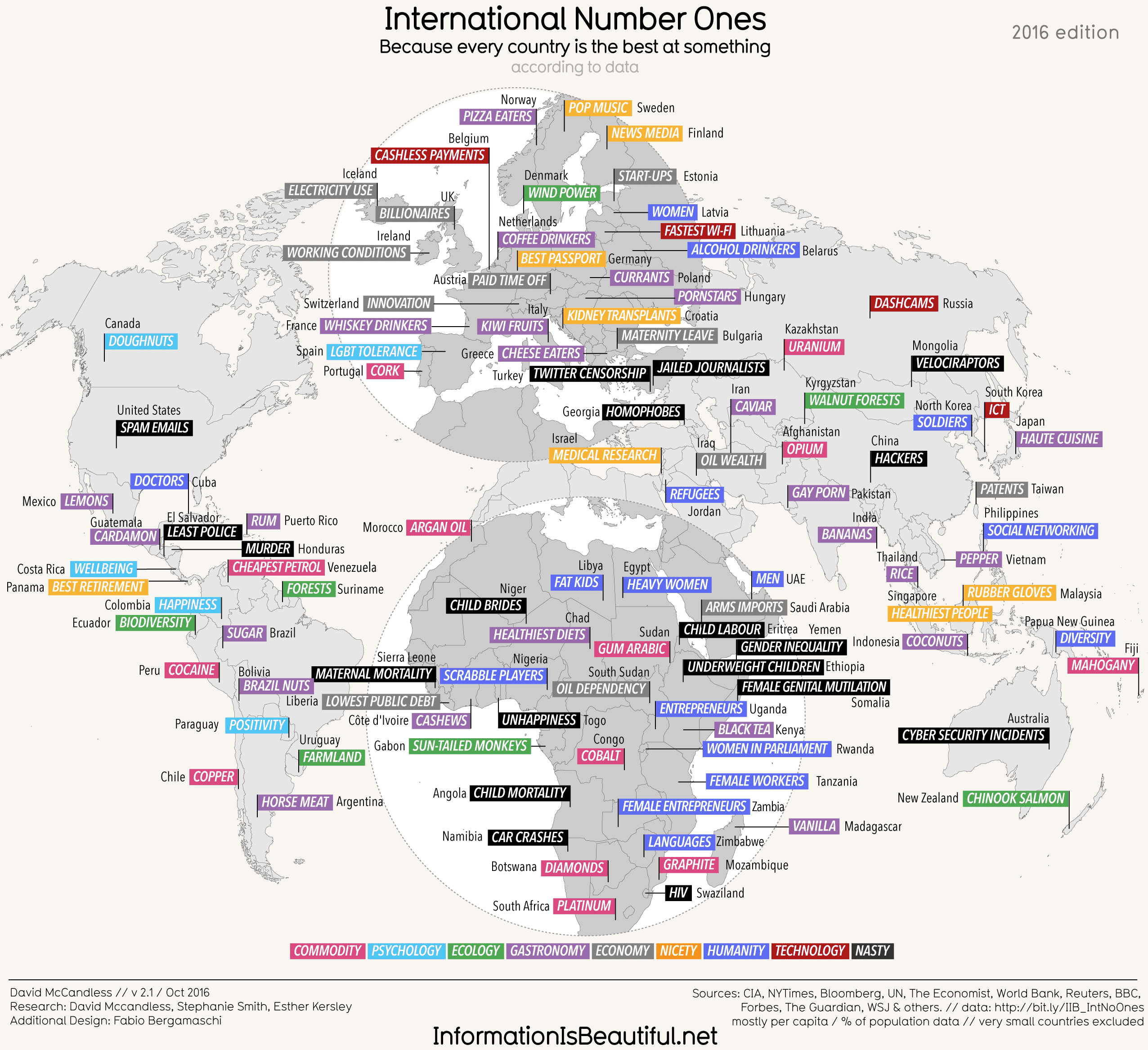
1.4.2 David McCandless
David McCandless is a British data-journalist and his blog Information is Beautiful (McCandless 2018) hosts some of the most visually stunning graphs, charts, and maps on a wide range of topics like science, food, dogs and countries. One such chart, International Number Ones: Because every country is good at something (according to data), is a captivating work that displays something each country is the best at (McCandless 2016). The visualizations on this website are updated and revised whenever new data is available.
One such chart, International Number Ones: Because every country is good at something (according to data), is a captivating work that displays something each country is the best at (McCandless 2016). The visualizations on this website are updated and revised whenever new data is available.
1.5 How to tell stories using data visualization’ and ‘exploratory data visualization’ theory example
1.5.1 A cool website: MIT Media Lab
(Deloitte, Datawheel, and Hidalgo 2016) MIT Media Lab in collaboration with Deloitte has created a new visualization tool, that aggregates US government open source data and mines information to generate trends and stories about cities, jobs, industries, etc. Just looking at any of the open data sources would give us an idea about the vastness (breadth and depth) of the available data. It is impressive that they have brought it all together on a single platform in a convenient format.
We think of a topic, and it is possible it is there! The benefits are a better understanding of our consumers, talent pool, jobs, climate, which helps improve our decision-making ability. The best part is that the data is also available for download so we can replicate the visuals, redesign and tell our own stories with this data. There are also other similar websites, that has some good visualizations on census data: (Bureau 2018a)
1.5.2 Standing out categorization of information on the website.
What stands out is the categorization of information on the website which enables the following:
- Easy browsing of various categories of information available at a single glance
- An easy search on any topic of interest and get more in-depth information
- Logical construction of information using data and visuals under each category
- Comparative analysis of cities
- Variety of exploratory visualizations to learn from
- Most important - Storytelling through data, such as the evolution of the American Worker, how poverty is bad for people’s health, how men still dominate in the highest paying industries, and opioid addiction damage.
1.5.3 Automatic visualization vs. context-specific visualization
Simple visualizations such as standard chart types (bar chart, line chart, etc.) are already automated to a certain extent in Microsoft Office tools and other software available in the market. However, full on automation where insight fountains out from any datasets are far-fetched at this point because it requires automated analysis. The automated analysis means that the tool or algorithm has to understand the context and also select the best visualization.
Automatic visualization is generally a bad idea. Some parts of visualization indeed should be automatic, such as standard chart types and recurring geometries. Pieces of visualization, such as annotation and axis construction can be automatic.
However, full-on automation where insight fountains out from any dataset is farfetched at this point because this requires automatic analysis. Analytics is usually context-specific and requires more than boilerplate statistics. The most interesting visualizations are context-specific. (Flowingdata 2017)
1.5.4 Data analytics software
Data analytics software can analyze vast amounts of data and incredible speeds, but how can it explain the results of that analysis? Today, the only means of doing this is with graphics. Data visualization still leaves room for interpretation. However, technology is catching up. Narrative generation software can run as a plug-in to the dashboards. Tools like Savvy install on a server and allow every dashboard user to get a written summary of demand. This software is fully plugged and play, it takes seconds to install, and it is easy to use. It runs with Microsoft Excel, Qlik Sense 3.0, and is available as an API. It is an example of how automation is making our working lives more comfortable by automating repetitive tasks and allowing us to leverage existing data reserves fully. (Manning 2016)
1.5.5 Data visualization can’t explain data, leaving room for interpretation.
According to Alysson Ferreira, a UI Engineer, there is an increasing need to understand the latest trends quickly and efficiently, which means there’s also a need for significant sources of trustworthy information. (Ferreira 2017)
This is where data visualization comes in. Data visualization is the art of displaying information by combining the beauty of imagery with the conciseness of statistics, which allows us to organize complex data into useful graphical representations. In simple terms, data visualization is the art of translating complex data into meaningful information. (Towler 2015)
Plug in any dataset into a magic box and it spits out a beautiful visualization you can show all of your co-workers, friends, and family. That is the promise of many startups, but it does not quite work that way. The problem is that graphics alone do not fully explain data, and so we are inundated with queries such as, why did the numbers fall in whatever month? Data visualization cannot explain data, thereby leaving room for interpretation.
1.5.6 One great tool: D3.js.
The focus in today’s world has been on open source tools and technologies and these tools although being free for the most part to require more effort to integrate to the current visualization workflow seamlessly. As mentioned in one of the articles about D3.js:
D3.js is one of the first data visualization tools that comes to mind when talking about free, open-source alternatives. It is a JavaScript-based library for creating web visualization and displays the results on the web page. However, with high power comes great responsibility. D3.js is one of the first data visualization tools that comes to mind when talking about free, open-source alternatives. It is a JavaScript-based library for creating web visualization and displays the results on the web page. However, with high power comes great responsibility.
Ultimately, the focus should be on our goals rather than our tools.
1.6 Additional Resources for Aspiring Data Visualists
Data visualization domain is vast and an aspiring visualizes, a person who can link between storytelling and data-experience design can further broaden his/her knowledge through:
1.6.1 Tableau Community
(Tableau Software 2018a) helps you to explore Tableau further :
- It will help us enhance our learning
- Get answers for most of your doubts In tableau
- Post new questions and crowd source answers
- Attend events, seminars and join conferences conducted locally/ globally
- Give back to the community once you become an expert in that field
There are very active Tableau social media groups (Tableau Software 2018b):
- Tableau Enthusiasts: LinkedIn Group (19K members)
- Tableau Software Fans & Friends: LinkedIn Group (45k members)
1.6.2 Blogs
Here are some blogs recommended by Tableau (Tableau Software 2018c):
| Blog | Description | Link |
|---|---|---|
| Storytelling with Data | This blog provides information about the fundamentals of data visualization and how to make data a critcal component of your story. | http://www.storytellingwithdata.com/ |
| Information is Beautiful | This blog was founded by David McCandless, the author of two bestselling infographics books, and provides a variety of visualizations, all of which are continuously revised and updated with the most recent data. | https://informationisbeautiful.net/ |
| Visualizing Data | This blog provides a space for data visualizers to share news and thoughts about the field as well as offers diverse content about current and cutting-edge techniques, discussion of both practical and theoretical topics. | http://www.visualisingdata.com/ |
| Junk Charts | This blog critiques a variety of graphics, providing insights about what works and what doesn’t in each visualization, and how to improve them. | http://junkcharts.typepad.com/ |
| The Pudding | This blog explores complex and contested issues through visual essays. | https://pudding.cool/ |
| The Atlas | This blog provides visualizations on a plethora of topics. | https://www.theatlas.com/ |
| Graphic Detail | This blog is the hub of The Economist’s data journalism; it provides examples of charts, maps, and infographics (all of which are often interactive). | https://www.economist.com/blogs/graphicdetail |
| Tableau Blog | The Tableau blog is a source of data viz trends, issues important to the Tableau community, and updates about Tableau products. | https://www.tableau.com/about/blog |
| Michael Sandberg’s Data Visualization Blog | Michael Sandberg’s blog discusses a wide variety of data visualization examples. In addition, the blog covers other topics such as Infographics, Data Science, Business Intelligence, Data Ethics, Storytelling and much more. | https://datavizblog.com/ |
| Beautiful Data Blog | This blog features discussion of all things data and has a wide range of categories to browse through. | http://beautifuldata.net/ |
| insert reference | Michael Sandberg’s blog discusses a wide variety of data visualization examples | https://datavizblog.com/ |
| insert reference | This blog features discussion of all things data | http://beautifuldata.net/ |
1.6.3 Podcasts
Here are some podcasts recommended by Tableau (source: https://www.tableau.com/about/blog/2015/8/want-more-data-your-ears-here-are-6-podcasts-worth-listening-43300) and other worth listening resources:
| Podcast | Description | Link |
|---|---|---|
| Policy Viz | The host of the podcast chats with guests primarily about data visualization, open data, big data, and technology to help people communicate data better. Episodes are all 20 minutes or shorter, and it’s mostly the guests speaking, not the host. | https://policyviz.com/podcast/ |
| Tableau Wanna Be Podcastl | The hosts are respected and passionate members of the Tableau community. The podcast is about all things related to Tableau, including interviews with other members of the Tableau community, Tableau employees, and in-depth discussions about visual analytics. | https://soundcloud.com/tableau-wannabe-podcast |
| What’s The Point | It talks about the many differnt ways data affect our lives, with interviewing people from many different walks of life (for example, astronomy, publishing, web tracking). It’s a short show each time, and the guests are the stars. | https://fivethirtyeight.com/tag/whats-the-point/ |
| Data Stories | This long-running podcast is about data visualisation in general and has consistently drawn in some very high-calibre guests. Each episode is about an hour, which suits longer commutes. | http://datastori.es/ |
| Storytelling with Data | This podcast is an additional resource to the Storytelling with Data blog, which covers topics related to data storytelling, better presentations, and all things data viz. | http://www.storytellingwithdata.com/podcast |
1.6.4 Useful Links on Data Visualization Resources, Trends, and Tutorials
| Resource | Description | Link |
|---|---|---|
| (Catalogue 2018) | You can find different types of plots used in data visualization | https://datavizcatalogue.com. |
| (Kosara 2018a) | Robert Kosara’s website which contains recent developments happening in visualization and are likely to have an impact. | |
| (Research 2018) | About Robert Kosara and his research papers. | |
| (Kosara 2018b) | Robert Kosara’s twitter handle. | |
| (FlowingData 2018) | Website which offers courses, tutorials and happenings in viz. | http://flowingdata.com/ |
| (Infogram 2018) | An infogram helps a user making different types of plots and learning the art of visualization. Engaging infographics, reports, charts, dashboards and maps can be easily created in minutes with it. | |
| insert reference | Improving data visualisation for the public sector (does this link work?) | http://www.improving-visualisation.org/ |
| insert reference | This resource is a data visualization gallery of weekly explorations of United States Census data | https://www.census.gov/dataviz/ |
| (Joerg Blumtritt, n.d.,) | This blog features discussion of all things data | http://beautifuldata.net/ |
| (Sandberg, n.d.) | Michael Sandberg’s blog discusses a wide variety of data visualization examples | https://datavizblog.com/ |
| (NA, n.d.) | This resource is a data visualization gallery of weekly explorations of United States Census data | https://www.census.gov/dataviz/ |
| (Agency 2018) | This resource provides a series of interactive data visualizations using FEMA data | https://www.fema.gov/data-visualization |
| insert reference | This blog features discussion of all things data | http://beautifuldata.net/ |
| insert reference | Improving data visualisation for the public sector (does this link work?) | http://www.improving-visualisation.org/ |
| insert reference | Michael Sandberg’s blog discusses a wide variety of data visualization examples | https://datavizblog.com/ |
| insert reference | This resource is a data visualization gallery of weekly explorations of United States Census data | https://www.census.gov/dataviz/ |
| insert reference | This resource provides a series of interactive data visualizations using FEMA data | https://www.fema.gov/data-visualization |
| insert reference | The History of Data Visualization Dashboard Insight, Dashboard Insight, 2013 | http://www.dashboardinsight.com/news/news-articles/the-history-of-data-visualization.aspx |
| insert reference | Current research: Deceptive visualizations, Infogram, 2016 | https://medium.com/@Infogram/study-asks-how-deceptive-are-deceptive-visualizations-8ff52fd81239 |
| insert reference | Agata Kwapien in Data Visualization, 2015 | https://www.datapine.com/blog/misleading-data-visualization-examples/ |
| insert reference | A Brief History of Data Visualization, York University, Michael Friendly, 2006 | http://www.datavis.ca/papers/hbook.pdf |
| insert reference | Data Visualization and the 9 Fundamental Design Principles, Melissa Anderson, 2017 | https://www.idashboards.com/blog/2017/07/26/data-visualization-and-the-9-fundamental-design-principles/ |
| insert reference | A Practitioner Guide to Best Practices in Data Visualization.Interfaces 47(6):473-488, Jeffrey D. Camm, Michael J. Fry, Jeffrey Shaffer, 2017 | https://doi.org/10.1287/inte.2017.0916 |
| insert reference | The 7 Best Data Visualization Tools In 2017 | https://www.forbes.com/sites/bernardmarr/2017/07/20/the-7-best-data-visualization-tools-in-2017/#3a12b8ea6c30 |
| insert reference | The Data Visualisation Catalogue | https://datavizcatalogue.com |
References
Aarons, Mark & R Farahnak, Gregory & Ehrhart. 2014. “Misleading Graphs: Real Life Examples.” https://www.researchgate.net/figure/Second-order-confirmatory-factor-analysis-factor-loadings-for-the-implementation_fig1_261732454.
Agency, Federal Emergency Management. 2018. “Federal Emergency Management Agency Data Visualization.” https://www.fema.gov/data-visualization.
“Best Real Estate Investing Example Powerpoint Presentation Examples,PPT:SG-14716000770769.” 2019. https://www.slidegeeks.com/business/product/best-real-estate-investing-example-powerpoint-presentation-examples.
Bureau, United States Census. 2018a. “Census Tools APIs Data Visualization Gallery.” https://www.census.gov/dataviz/.
Catalogue, The Data Visualisation. 2018. “Charts- Data Visualization.” https://datavizcatalogue.com/search.html.
“Data Visualization.” n.d. https://www.microstrategy.com/us/resources/introductory-guides/data-visualization-what-it-is-and-why-we-use-it.
Deloitte, Datawheel, and Cesar Hidalgo. 2016. “Data Usa: Search, Map, Compare, and Download Us Data.” https://datausa.io/.
Disney, Andrew. 2017. “Graph Visualization Use Cases: Law and Fraud.” https://cambridge-intelligence.com/graph-visualization-use-cases/.
Ferreira, Alysson. 2017. “A Ui Engineer’s Thoughts on Data Visualization Tools.” http://blog.avenuecode.com/a-ui-engineers-thoughts-on-data-visualization-tools.
Flowingdata. 2017. “Automatic Visualization Is a Bad Idea, Generally Speaking.” https://flowingdata.com/2017/04/07/automatic-visualization-is-a-bad-idea-generally-speaking/.
FlowingData. 2018. “Flowing Data-Website.” http://flowingdata.com/.
Friedman, Vitaly. 2008. “Data-Visualization-and-Infographics.” https://www.smashingmagazine.com/2008/01/monday-inspiration-data-visualization-and-infographics/.
Friendly, Michael. 2006. “A Brief History of Data Visualization.” http://www.datavis.ca/papers/hbook.pdf.
“History of Data Visualization.” n.d. https://www.sas.com/en_us/insights/big-data/data-visualization.html.
Infogram. 2016. “Key Figures in the History of Data Visualization.” https://medium.com/@Infogram/key-figures-in-the-history-of-data-visualization-30486681844c.
Infogram. 2018. “Infogram- Data Visualization.” https://infogram.com/page/data-visualization.
Jeff Baker, Donald R. Jones, Jim Burkman. 2009. “Using Visual Representations of Data to Enhance Sensemaking in Data Exploration Tasks.” http://eds.b.ebscohost.com.libproxy.scu.edu/ehost/pdfviewer/pdfviewer?vid=7&sid=36a12051-8b56-40cc-907c-4ca58a5274f8%40sessionmgr103.
Joerg Blumtritt, Benedikt Koehler. n.d. “Beautiful Data.” http://beautifuldata.net/.
Kosara, Robert. 2018a. “Eagereyes.” https://eagereyes.org/.
Kosara, Robert. 2018b. “Twitter Handle- Robert Kosara.” https://twitter.com/eagereyes?ref_src=twsrc%5Egoogle%7Ctwcamp%5Eserp%7Ctwgr%5Eauthor.
Manning, Arden. 2016. “Workplace Automation: Making Data Visualization Smarter.” https://yseop.com/blog/automation-making-data-visualization-smarter/.
McCandless, David. 2016. “International Number Ones.” https://informationisbeautiful.net/2016/international-number-ones/.
McCandless, David. 2018. “Information Is Beautiful.” https://informationisbeautiful.net/.
NA. n.d. “Data Visualization Gallery.” https://www.census.gov/dataviz/.
Pittenturf, Chris. 2018. “What Is Data Visualization and Why Is It Important?” https://data-visualization.cioreview.com/cxoinsight/what-is-data-visualization-and-why-is-it-important-nid-11806-cid-163.html.
Research, Tableau. 2018. “Robert Kosara- Research.” https://research.tableau.com/user/robert-kosara.
Rosling, Han. n.d. “Advantages and Disadvantages of Tableau.” https://www.gapminder.org/tools/#$chart-type=bubbles.
Rosling, Hans. 2009. “Asia’s Rise – How and When.” https://www.ted.com/talks/hans_rosling_asia_s_rise_how_and_when.
Ruan, Zichan, Yuantian Miao, Lei Pan, Nicholas Patterson, and Jun Zhang. 2017. “Visualization of big data security: a case study on the KDD99 cup data set.” Digital Communications and Networks 3 (4): 250–59. https://doi.org/10.1016/j.dcan.2017.07.004.
Sandberg, Michael. n.d. “Michael Sandberg’s Data Visualization Blog.” https://datavizblog.com/.
smith. 2019. “Exploratory Data Analysis of Prosper.com Lending Data.” http://miamidatascientist.com/exploratory-data-analysis-prosper-lending-data/.
Tableau Software. 2018a. “Tableau Community.” https://community.tableau.com/welcome.
Tableau Software. 2018b. “Tableau Groups.” https://www.linkedin.com/search/results/groups/?keywords=tableau{\&}origin=SWITCH{\_}SEARCH{\_}VERTICAL.
Tableau Software. 2018c. “The 10 best data visualization blogs to follow.” https://www.tableau.com/learn/articles/best-data-visualization-blogs.
Towler, Will. 2015. “Data Visualization: The Future of Data Visualization.” http://analytics-magazine.org/data-visualization-the-future-of-data-visualization/.