Chapter 5 Ethics
This chapter covers the ethical implication of data visualizations. Ethics refers to a set of moral principles that dictate a person’s behavior. While the field of ethics is often considered to be a theoretical discipline, ethical conduct is an important objective in practice. In the field of data visualization, there are many opportunities to manipulate viewers with untruthful representations of data; thus, like any other discipline, data visualization faces significant ethical challenges. This chapter will touch on the importance of ethics in visualization, guidelines for ethical visualization, topics relating to data deception, ethical challenges faced when creating a visualization, visualization and social change, and more.
5.1 Importance of Ethics in Visualization
(Cairo 2014)
Alberto Cairo illustrates the importance of ethics in his infographics. He sees data visualization as harmonization of journalism and engineering. From these two disciplines, he takes the journalist ethos of truth-telling and combines this with an engineering focus on efficacy and efficiency. The result is a data visualization that contains accurate and relevant information which is precisely and concisely conveyed. Cairo explains that as a “rule utilitarian,” he believes it is “morally right” to create graphics in this way. Here, it is useful to review his blog post introducing the article. In short, the responsibility of an ethical data visualizer is to create the most good while doing the least harm. As such, conveying honest and relevant information increases a person’s understanding, and increased understanding and knowledge positively correlates with personal well-being.
Alberto Cairo addresses the ethical ‘why’ of data visualization in this article, while still grounding the discussion in a straightforward analysis of harmful and helpful practices. He emphasizes that the effectiveness of the display’s communication of a message is as important as the information itself. This makes intuitive sense because useful information is rendered utterly useless if no one can understand it.
In order to better understanding the importance of ethics, a video called ‘Practicing Good Ethics in Data Visualization’ by the University of California, Davis video has an excellent example to explain the reason. (“Practicing Good Ethics in Data Visualization,” n.d.)
Again, since the moral purpose is to improve well-being through understanding, a graphic that is confusing or misleading is unethical, regardless of intent, since it creates misunderstanding for the audience. While it can be a bit jarring to think of a poorly designed graphics as “morally wrong,” it is essential to think of the unintended consequences that powerful yet misleading visuals may have on their viewers.
5.2 Ethical dimensions of Visualization
( Michael Correll 2018) Visualizations have a potentially enormous influence on how data are used to make decisions across all areas of human endeavor. This power of visualization connects to ethical duties and moral obligations to designers, builders, and researchers of visualizations. There exists a familiar feeling that data and data visualization, respectively, are apolitical or somehow ethically neutral and therefore leads to a lack of moral obligations with regards to how data are collected and visualized. This tendency to view visualization as mere reporting or structuring of objective fact is more dangerous. It is essential to understand that data and visualization are not ethically neutral. Data are not unbiased; they are always collected or processed by someone, for some aim. Often the work that goes into managing and structuring data is made invisible. Furthermore, the purposes for which data are collected and used is given less importance than the collection of insights to be gathered.
Obligations for professionals in the Visualization field: Visualization operates at the intersection of science, communication, and engineering. Professionals in these fields have specific ethical requirements as scientists, engineers, and journalists because they possess a great deal of power over how people ultimately make use of data both in visual patterns and the conclusions they draw. Following are three ethical challenges of visualization work, related to visibility, privacy, and power. There are associated principles and limitations of each category.
Visibility: To make the invisible visible * Visualize hidden labor * Visualize hidden uncertainty * Visualize hidden impacts Associated limitations with this principle are that visualizations are already involved and designers must frequently struggle with the comprehensibility of their designs and the literacy of their audience. Managing complexity is, therefore, a virtue in design that can be in direct opposition with the desire to visualize the invisible.
Privacy: To collect data with empathy * Encourage Small Data * Anthropomorphize data * Obfuscate data to protect privacy Associated limitations with this principle are restricting the type and amount of data that is collected has a direct impact on the quality and scope of the analyses hence obligation to provide context, and analytical power can, therefore, stand in direct opposition to the empathic collection of data.
Power: To challenge structures of power * Support data due process. * Act as data advocates. * Pressure unethical analytical behavior. Here the limitations are that the goal of promoting truth and suppressing falsehood may require amplifying existing structures of expertise and power, and suppressing conflicts for the sake of rhetorical impact.
5.3 General Guidelines for Ethical Visuals
(Skau 2012)
Data visualization is an up-and-coming field that currently does not have many established regulations. This makes it easy to manipulate readers without technically reporting false information. However, certain standards should be followed in order to generate meaningful and accurate visuals. The process can be broken down into three steps, each with its own set of guiding rules.
5.3.1 Data Collection
The first step in any project is gathering the data. This is relatively simple and does not offer much of an opportunity to introduce confusion. The one thing to remember is to always get data from a reliable source. The data provides the foundation for the entire project and must, therefore, be trustworthy and verifiable. Furthermore, special care should be taken for identification of inherent biases while using an existing dataset or creating a new one.
In addition, Cairo briefly addresses four guidelines that are applicable in all information gathering fields:- Beware of selection bias when choosing preexisting datasets, validate the data, and include essential context.
- False or irrelevant information does not improve anyone’s decision-making capacity, so it cannot enhance well-being.
- Even if the information is both accurate and relevant, moral pitfalls may remain.
- To avoid the unethical trap of inscrutable or misleading graphics, Cairo exhorts us to take an evidence-based approach when possible. The purpose of the graphic dictates the form it takes; aesthetic preferences should never override clarity.
![A strange correlation between ice cream sales and murders (Source: [@harlin-coorelation])](images/harlin-ice-cream.png)
Figure 5.1: A strange correlation between ice cream sales and murders (Source: (Harlin 2013))
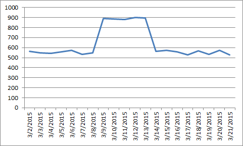
Another trick for creating misleading graphs is an axis change: Changing the y-axis maximum affects how the information in the graph is perceived. A higher maximum will make the graph appear less volatile or steep than a lower maximum. The axis can also be altered to deceive by changing the ratio of a graph’s dimensions, as demonstrated in the below graphs.
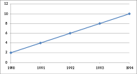
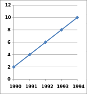
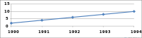
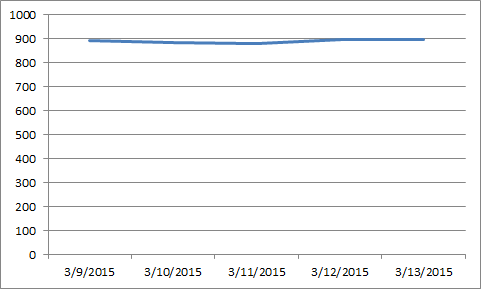
While not technically wrong, improper extraction, tactic omitting data or including only a certain chunk of data is certainly misleading. This is more common in graphs that have time as one of their axes.
Visualizations should be simple and easy to understand, but at the same time they should contain the essence of responsible visualization. To make final results pure, ethical procedures need to be practiced throughout all the steps of visualization.
5.4 The Data Visualization Hippocratic Oath
The question of ethics in data visualization is not something that comes to the fore when we start working. It is rarely the case that one sets out to deceive without altering data. The topic of good ethics in data visualization is very important and it is the duty of the creator to take care of it.
At VisWeek2011, Jason Moore suggested a hippocratic oath for visualization. It is intended to be succinct and easy to remember, while still containing the essence of responsible visualization:
“I shall not use visualization to intentionally hide or confuse the truth which it is intended to portray. I will respect the great power visualization has in garnering wisdom and misleading the uninformed. I accept this responsibility willfully and without reservation, and promise to defend this oath against all enemies, both domestic and foreign.”
References
Cairo, Alberto. 2014. “Ethical infographics In data visualization, journalism meets engineering.” https://www.dropbox.com/s/pqgmg02yz0pgju4/EthicalInfographics.pdf.
Harlin, Ky. 2013. “The 10 Most Bizarre Correlations.” https://www.buzzfeed.com/kjh2110/the-10-most-bizarre-correlations.
Michael Correll. 2018. “ Ethical Dimensions of Visualization Research.” https://arxiv.org/pdf/1811.07271.pdf.
“Practicing Good Ethics in Data Visualization.” n.d. https://www.coursera.org/lecture/dataviz-design/practicing-good-ethics-in-data-visualization-YqHHo.
Skau, Drew. 2012. “A Code of Ethics for Data Visualization Professionals.” https://visual.ly/blog/a-code-of-ethics-for-data-visualization-professionals/.